


Loop Website Redesign
In The Loop
ADES 3510.501 Interaction Design - Stephen Zhang - Fall 2020
Loop is a company committed to reducing single use and wasteful packaging worldwide. They created a system for shipping out and returning brand name products in reusable packaging for everything from household products, to food, to pet supplies. At the start of our project, they had just partnered with Kroger and Walgreens and had announced plans to start a program of reusable products to be used in the fast food industry.
The project we were given was to evaluate Loop as a brand, research what changes were needed through client profiles and user testing, and redesign the website to be more functional and fitting to their mission. Our team was composed of Peyton Pogue, Fabiana Perez, Eddie Guerrero, and myself.
Research and Wireframes
Following our research into Loop as a company and evaluating what issues we had with the site, we started on creating wireframes for possible pages on the site. Below are my additions of both low fidelity and mid fidelity wireframes, as well as a look at some of the card sorting and user flow that was considered during this process.


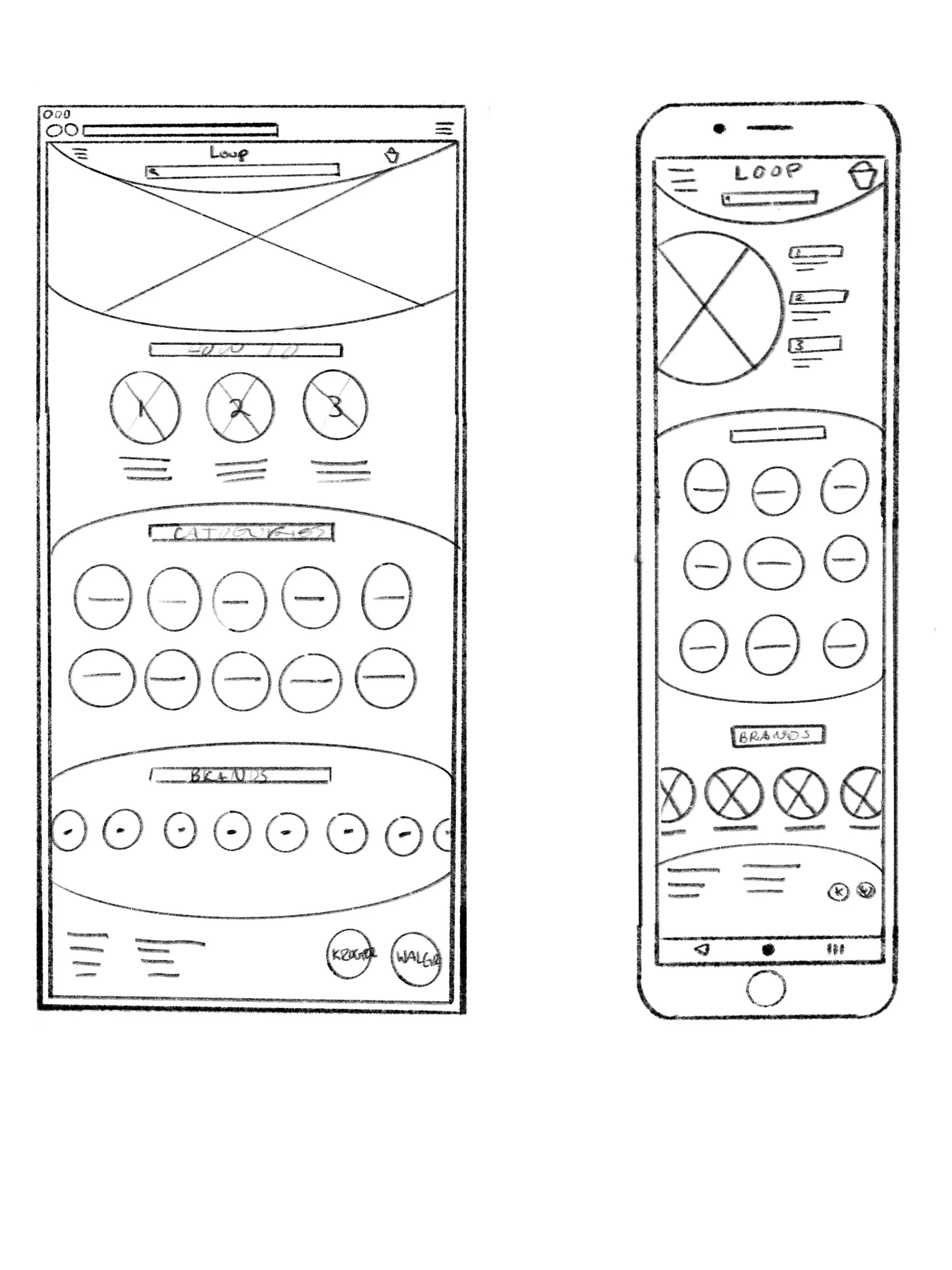

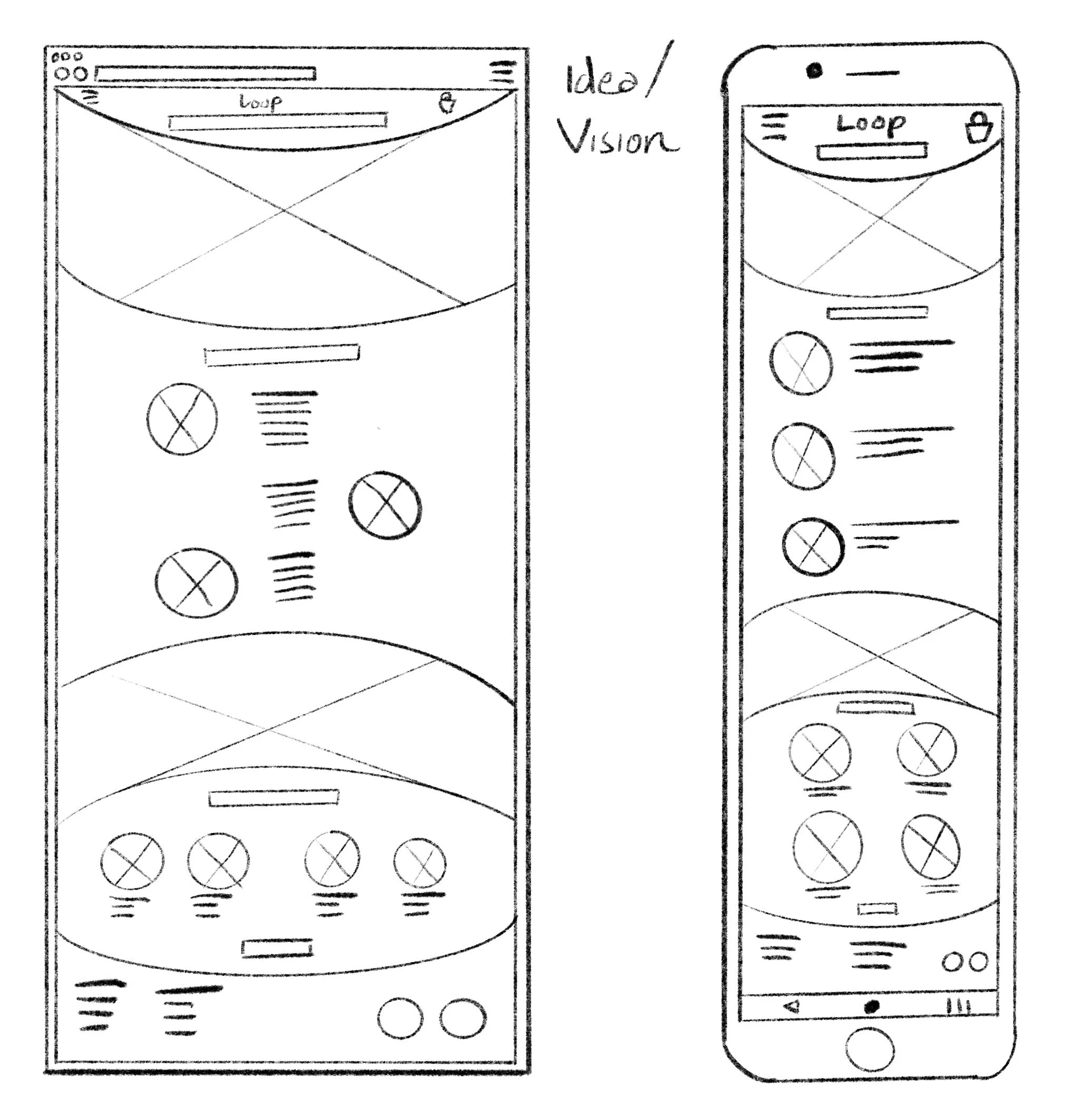


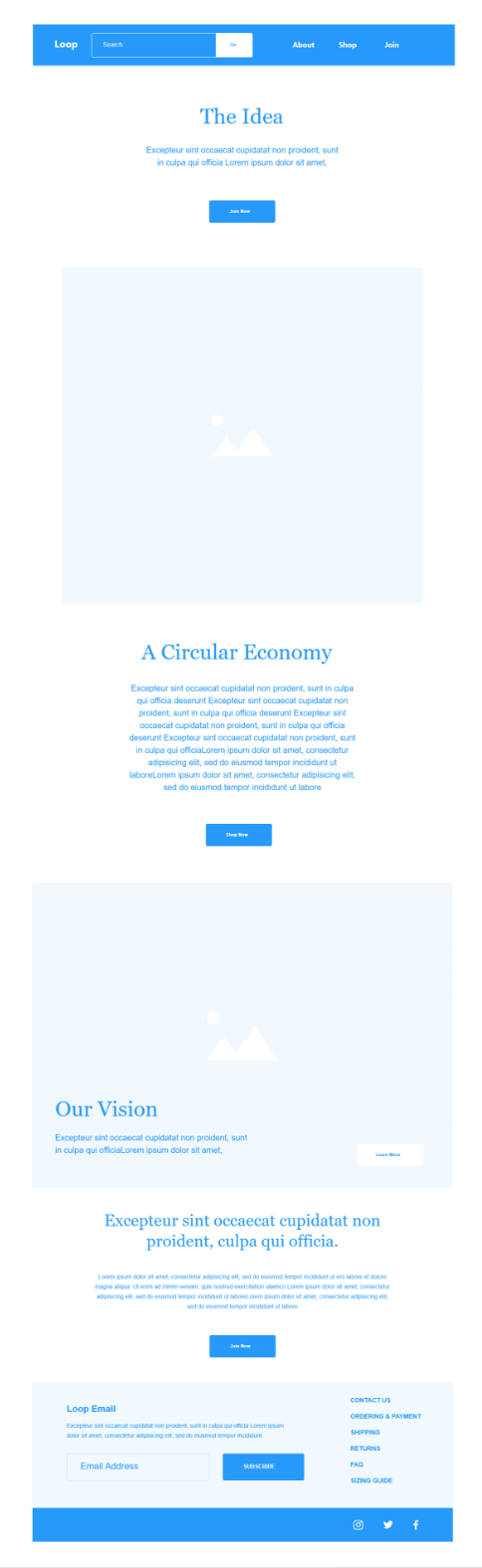
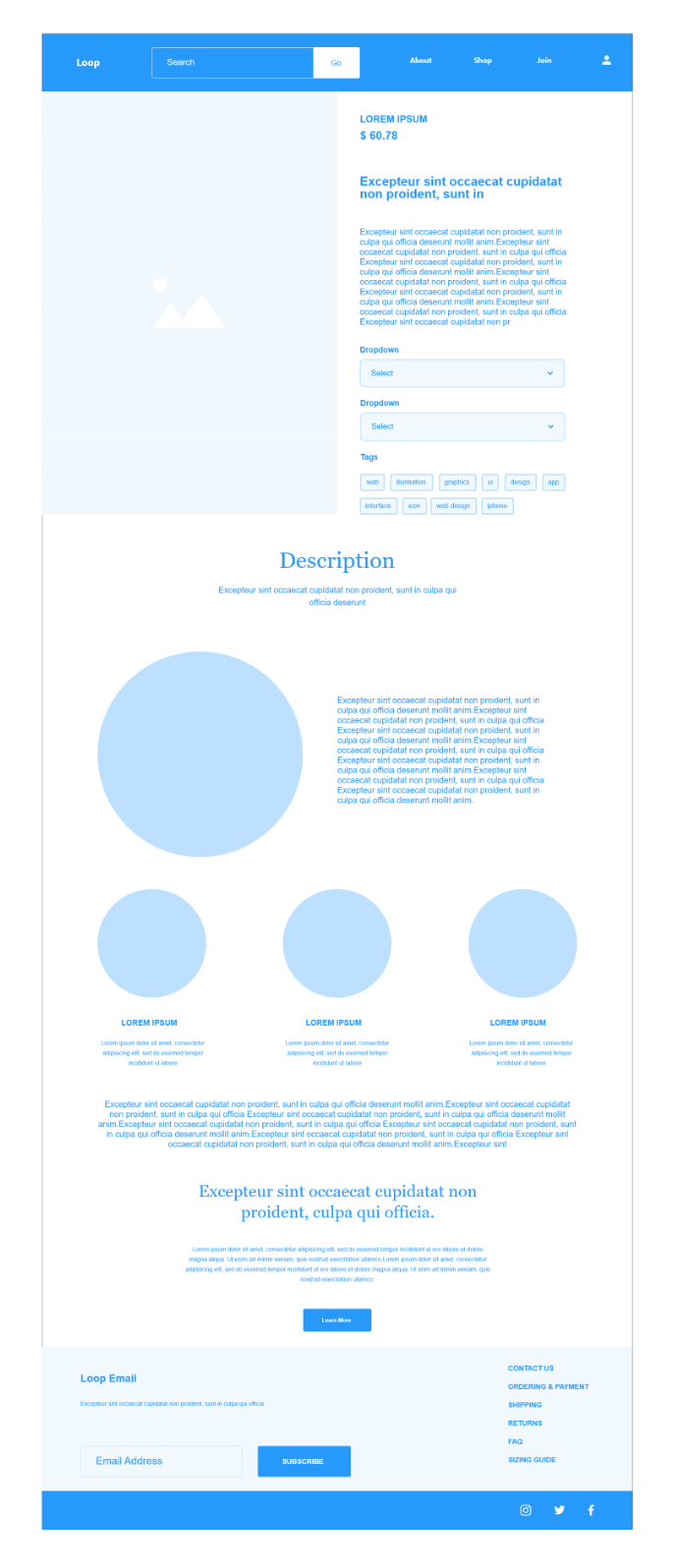

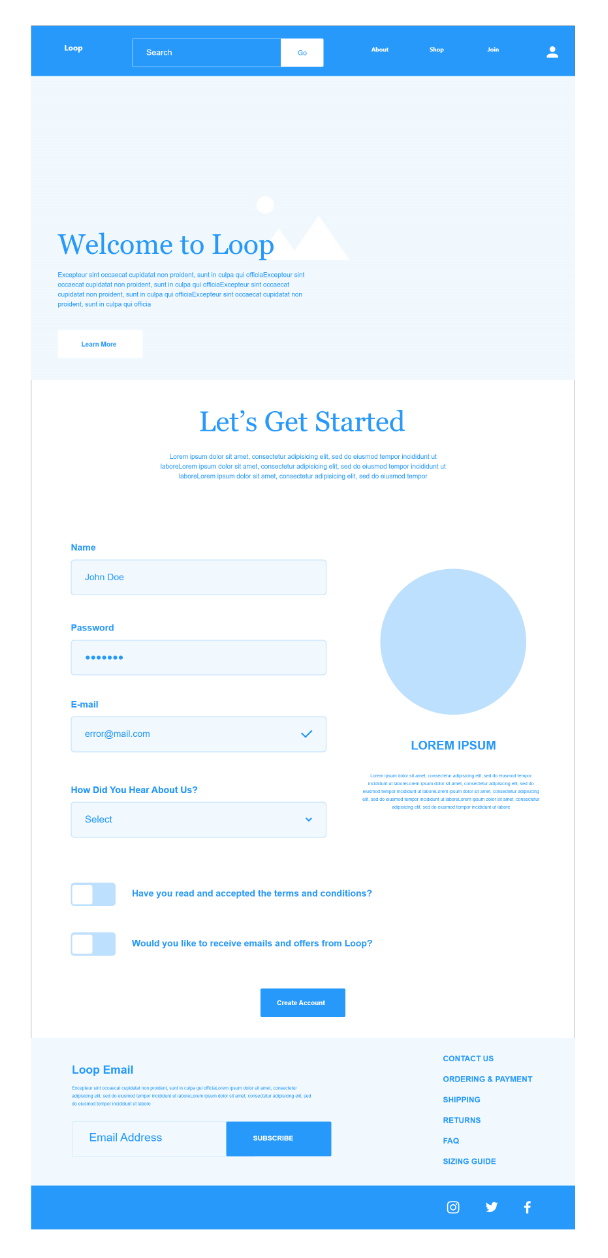
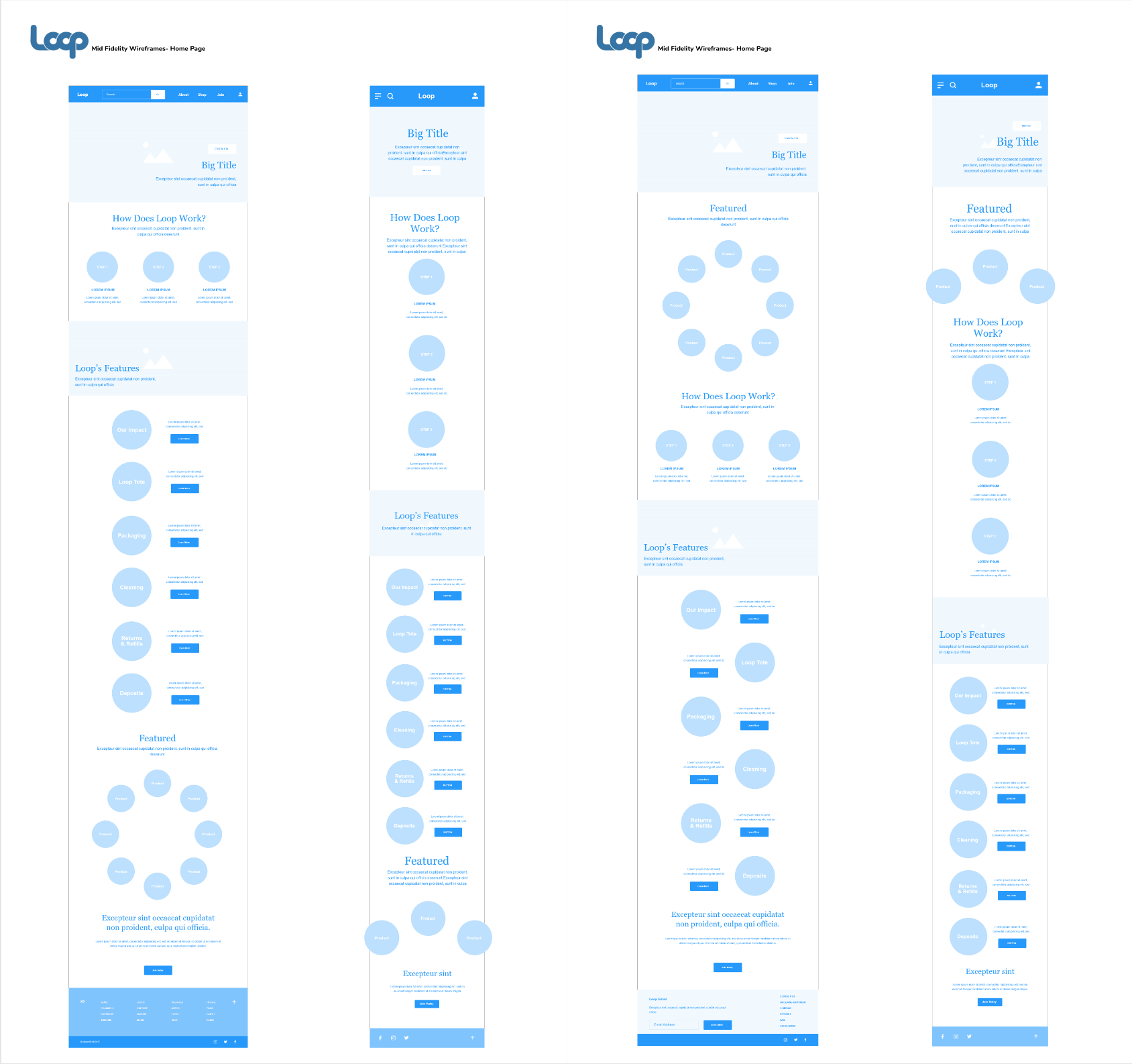
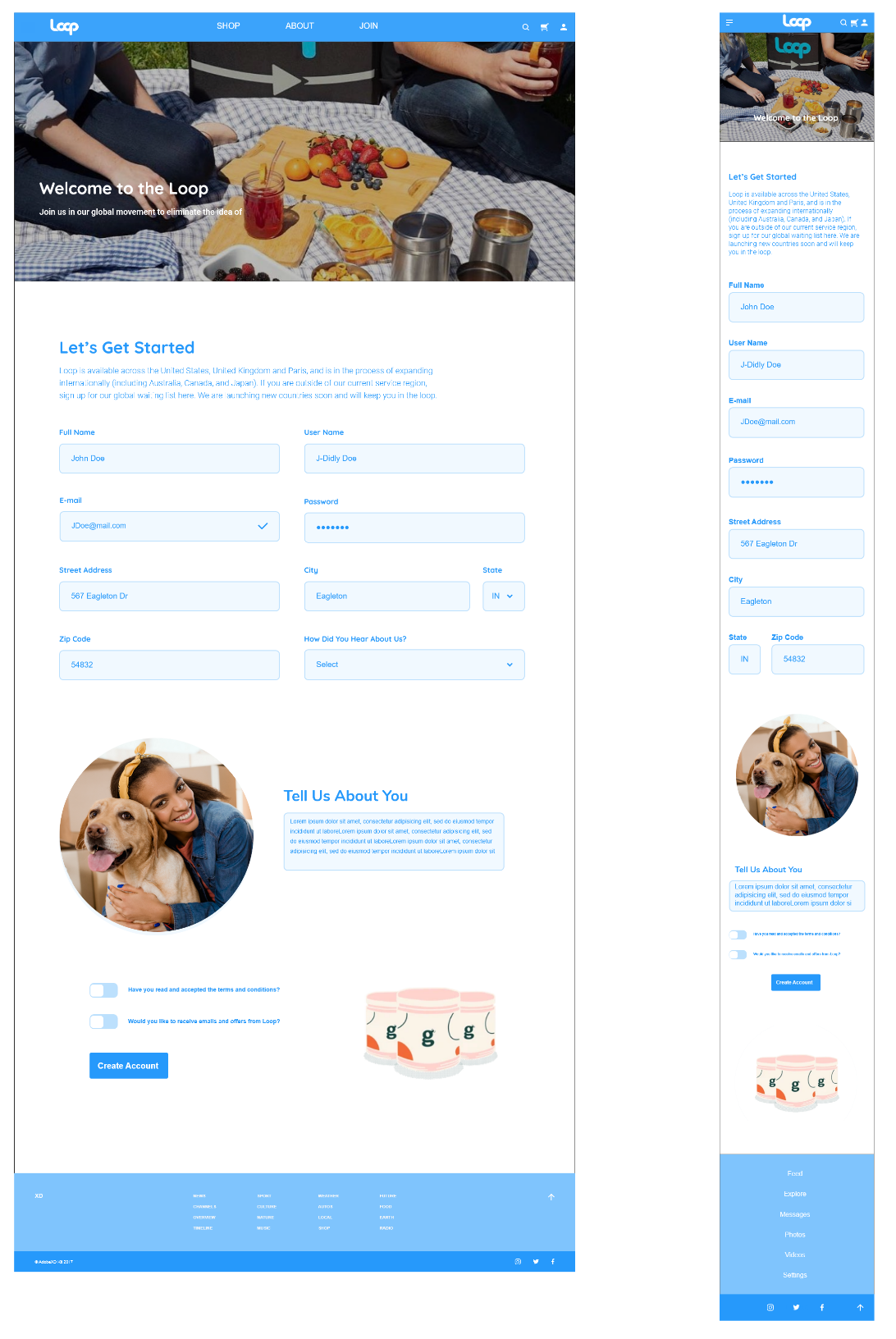

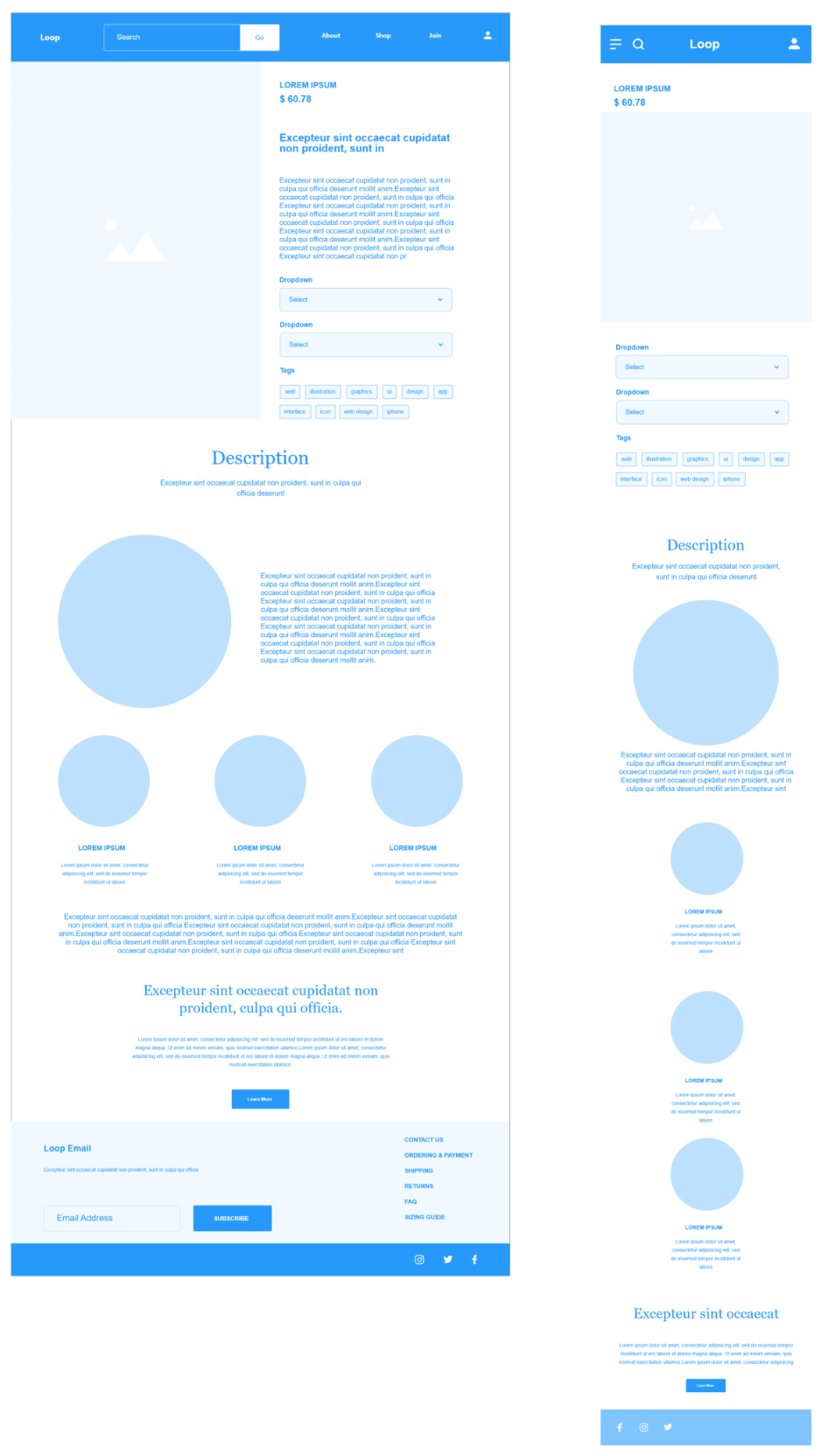
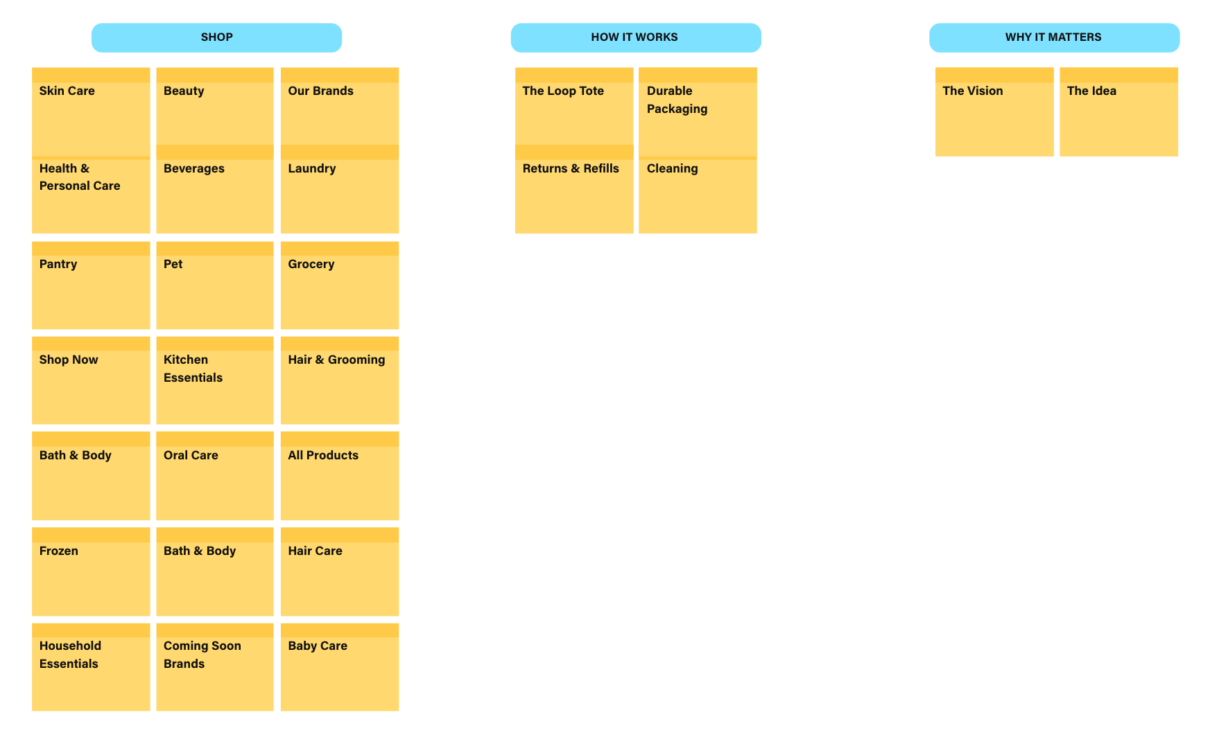

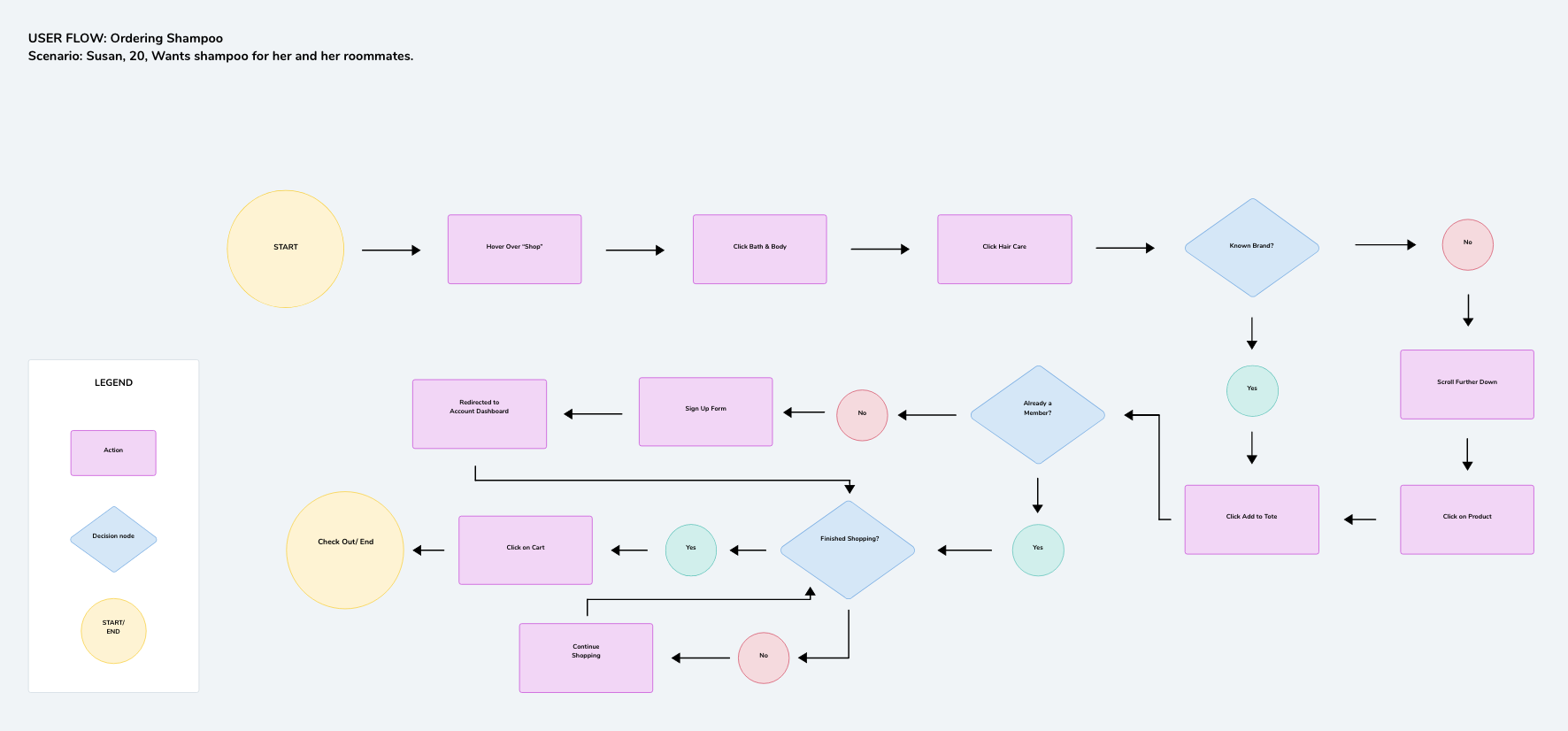
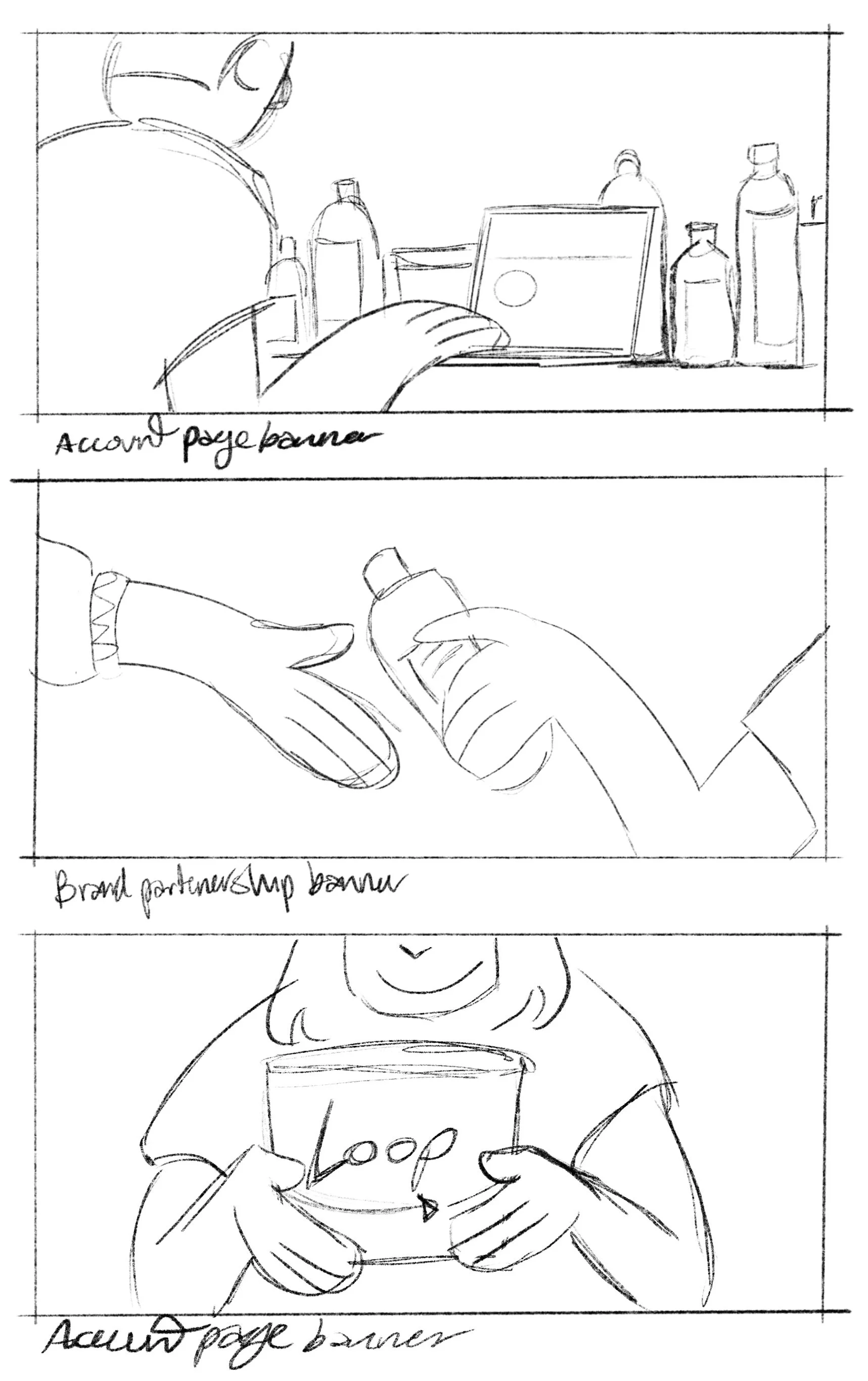
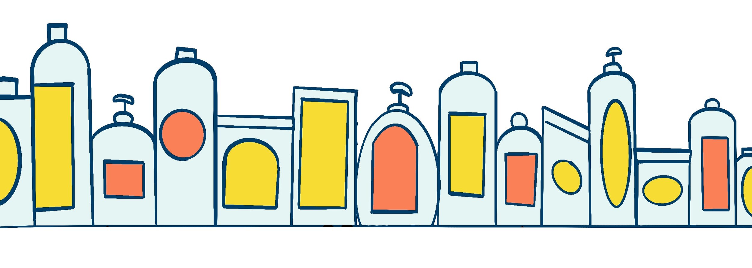
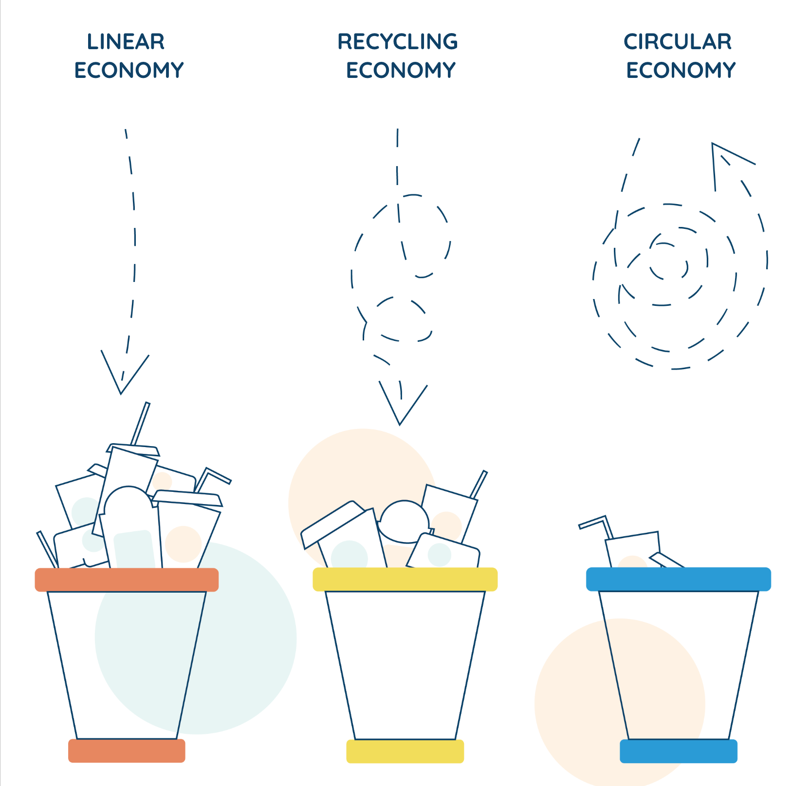
Illustration and Design Elements
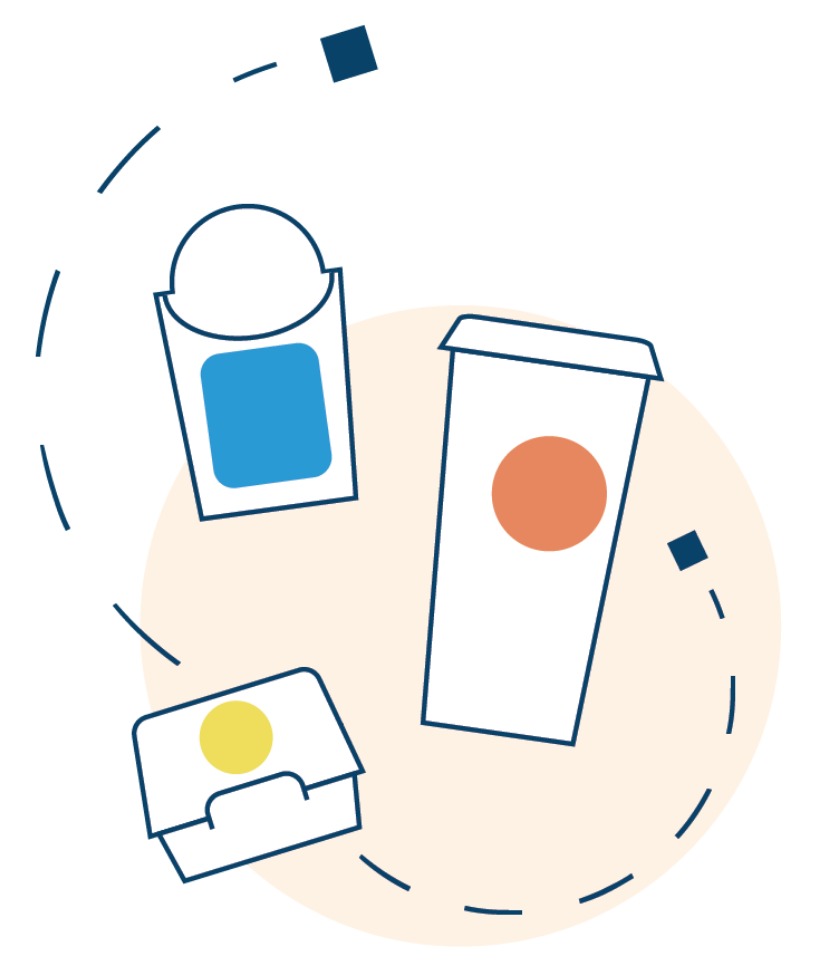
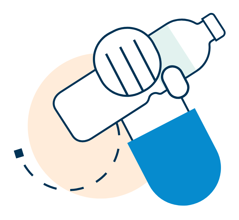
Something important to us that the original site had not fully developed was the use of a consistent and simple design language to be seen in on-site illustrations and graphics. While the original site used many different elements that would clash with each other or not form consistent identities, we believed it was important to flesh out a style that could be used across both the site and social media. Below are a handful of thumbnails from my process of working out a style for the site.

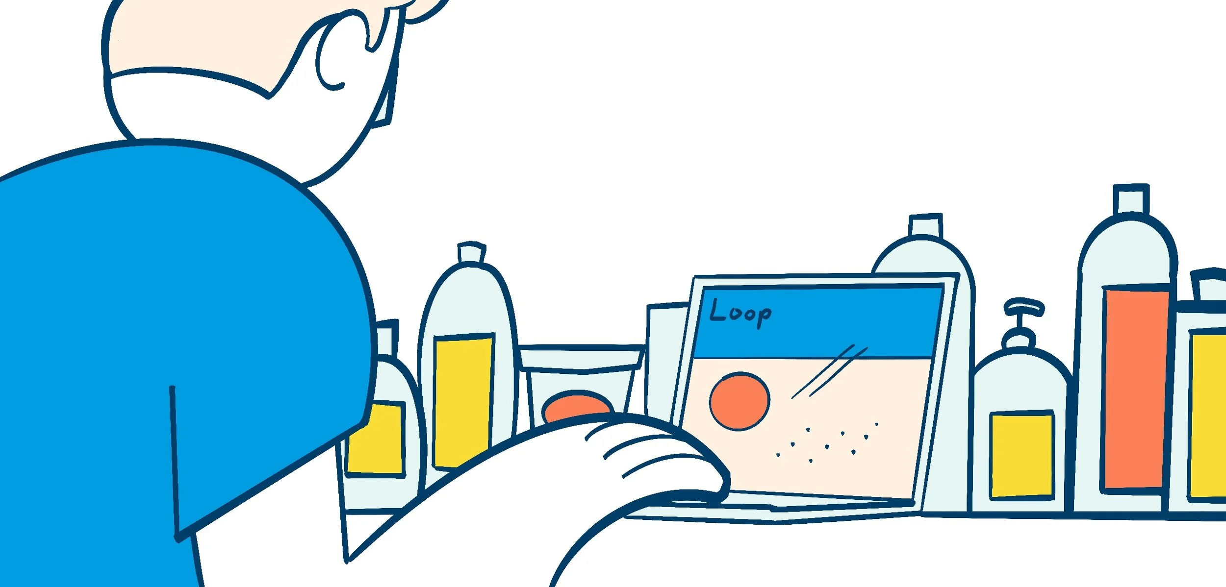
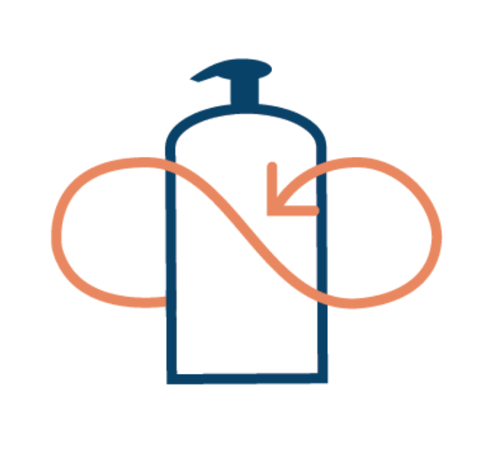
These later translated into elements I created across multiple pages of the site. We decided that a simple style would be useful to the users of the site as illustrations of concepts that Loop often left very confusing in their descriptions, as the process of shipping and returning products could get a little convoluted when not properly displayed for the customer.


The Final Site
The final site was assembled in Adobe XD across desktop, tablet, and mobile layouts. While the changes of the site on my part were largely based in the design of graphic elements and layout, we worked together to create a site that is easy to navigate through refinement of the header menus and made an environment that is not as overwhelming to the viewer upon first entry. We added elements such as a waste tracker that would display how much consumers were impacting the environment with each purchase, and tried to convey to users how easy switching to Loop for their everyday needs really is.


