


A Church Is Burning
Story And Song Through Design
ADES 2501.501 Typography I - Karen Dorff - Fall 2019
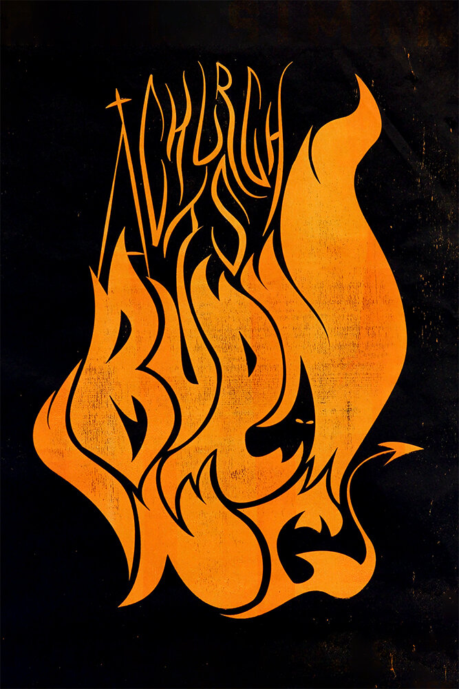
This project was an exercise in using exclusively type to show content, context, and emotion of a song. We were each assigned a song to design a poster for a hypothetical on-campus concert featuring that artist.
The song I was assigned was Paul Simon’s “A Church is Burning”, which is about the KKK burning Black churches in the south and the resilience of the survivors following it.
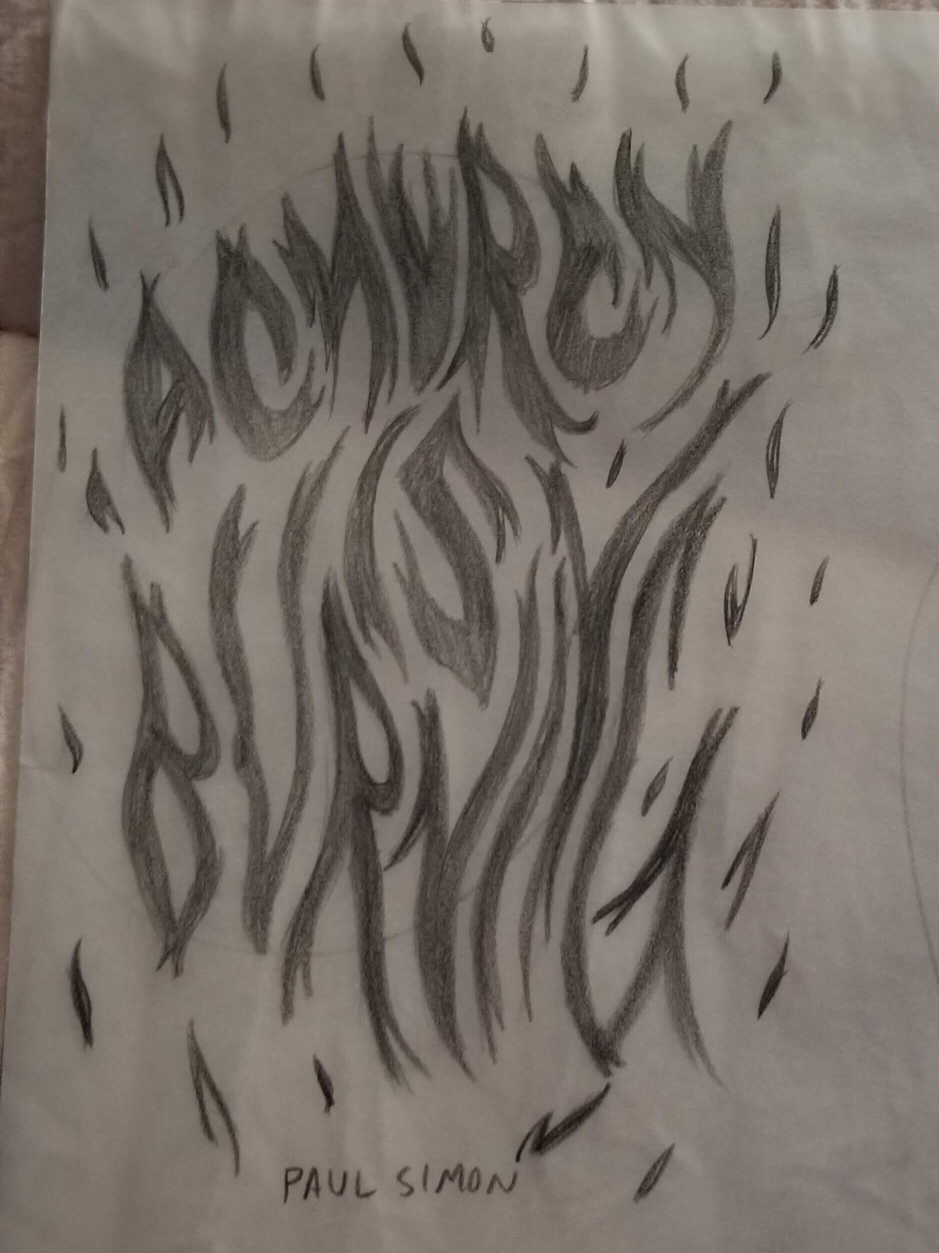
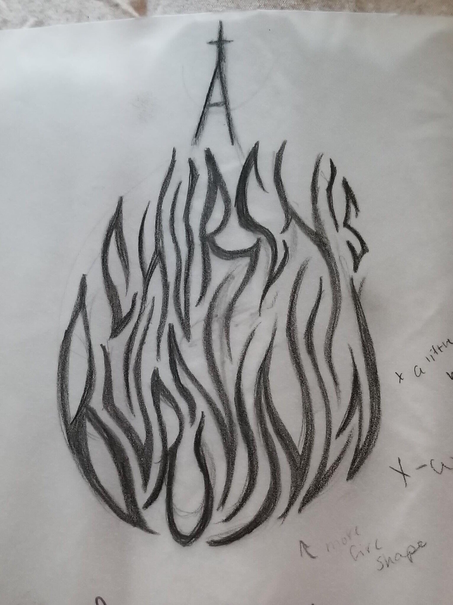
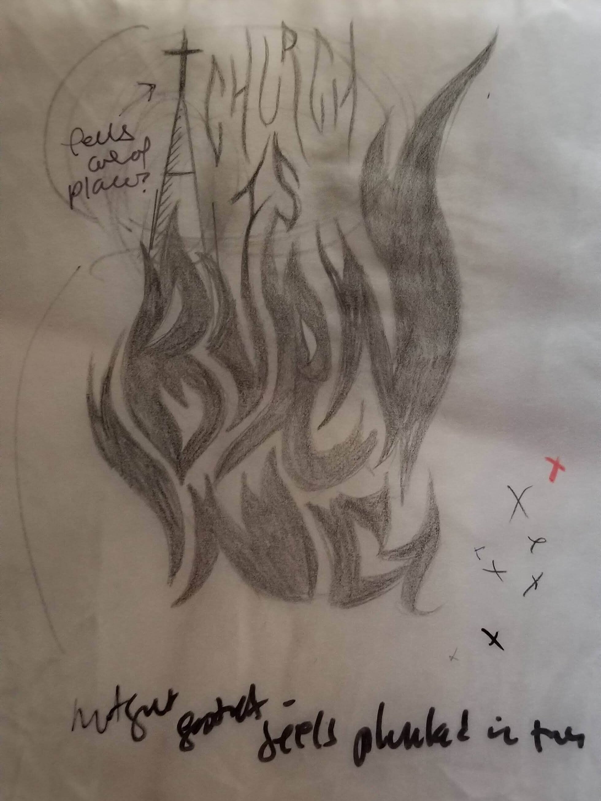
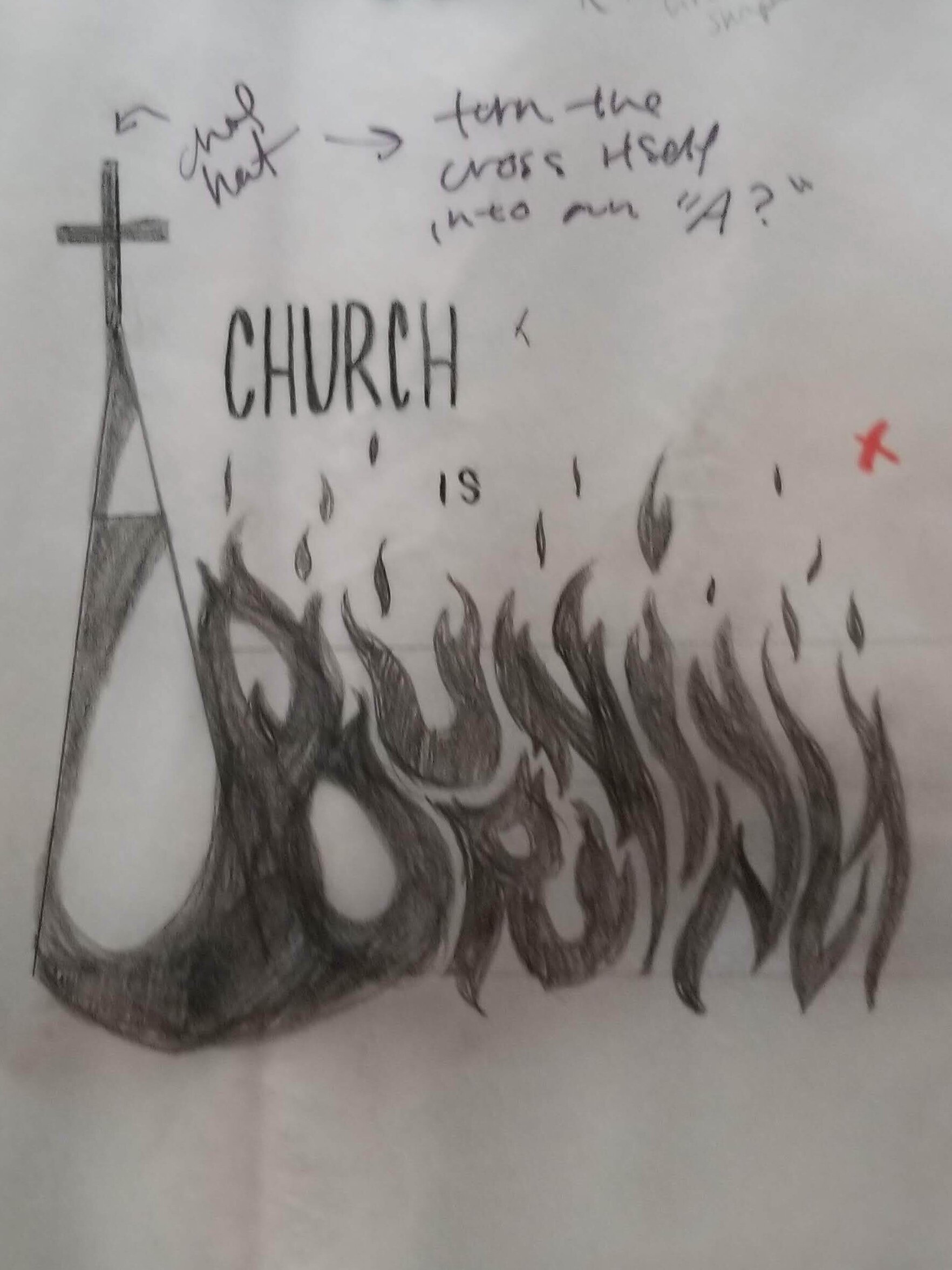
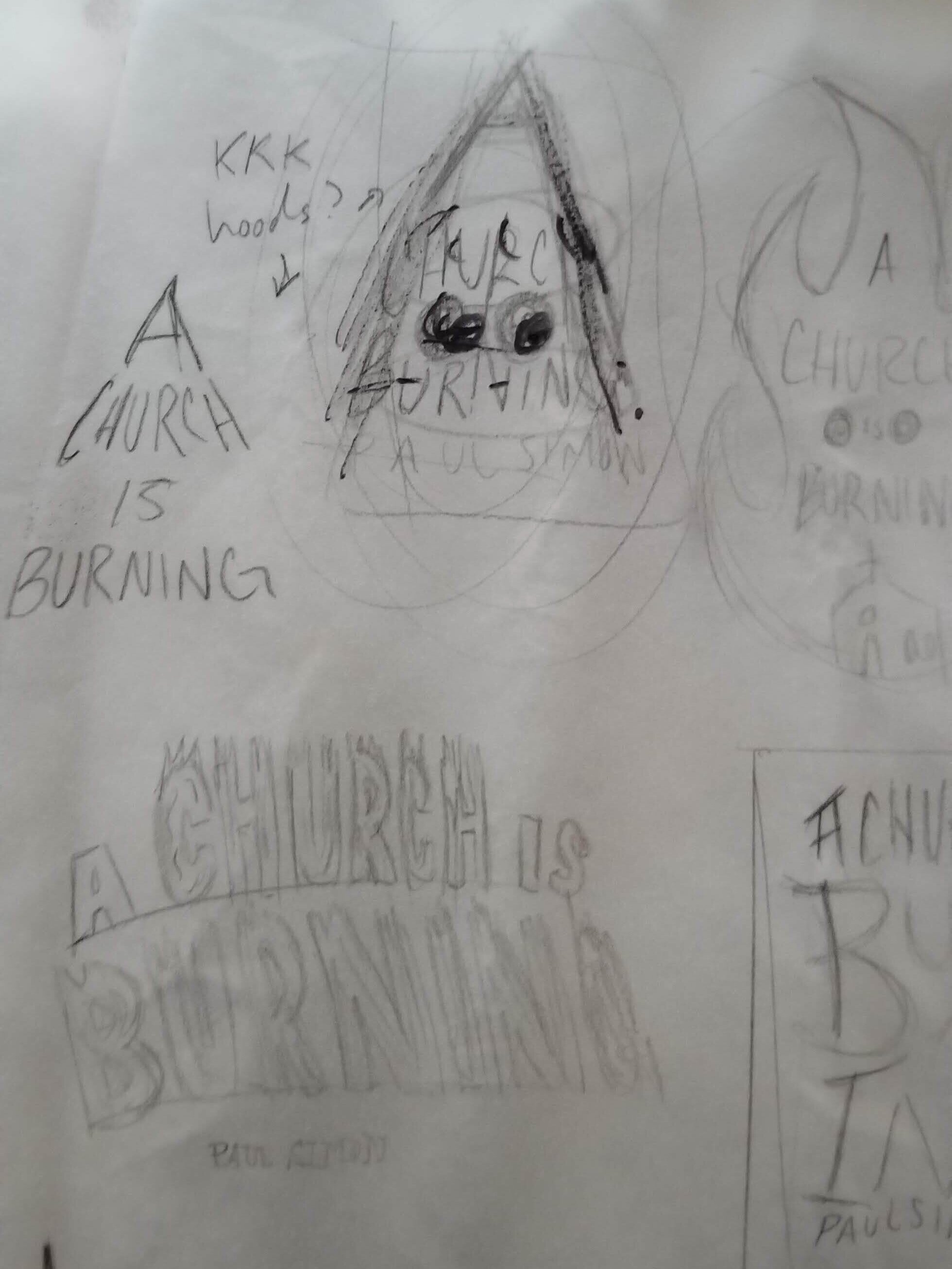
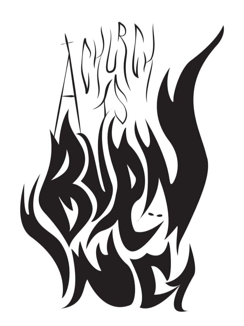
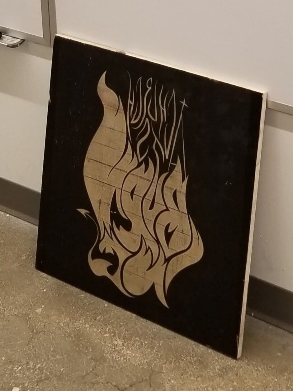
During the research and thumbnail process, I was drawn to the idea of using flame like strokes to form expressive typography. I also discovered that I could use both the type as well as the spaces between to create shapes like a KKK hood, a church steeple, and a devil tail and horns to add and understanding of context and concept without the viewer needing to hear the song.
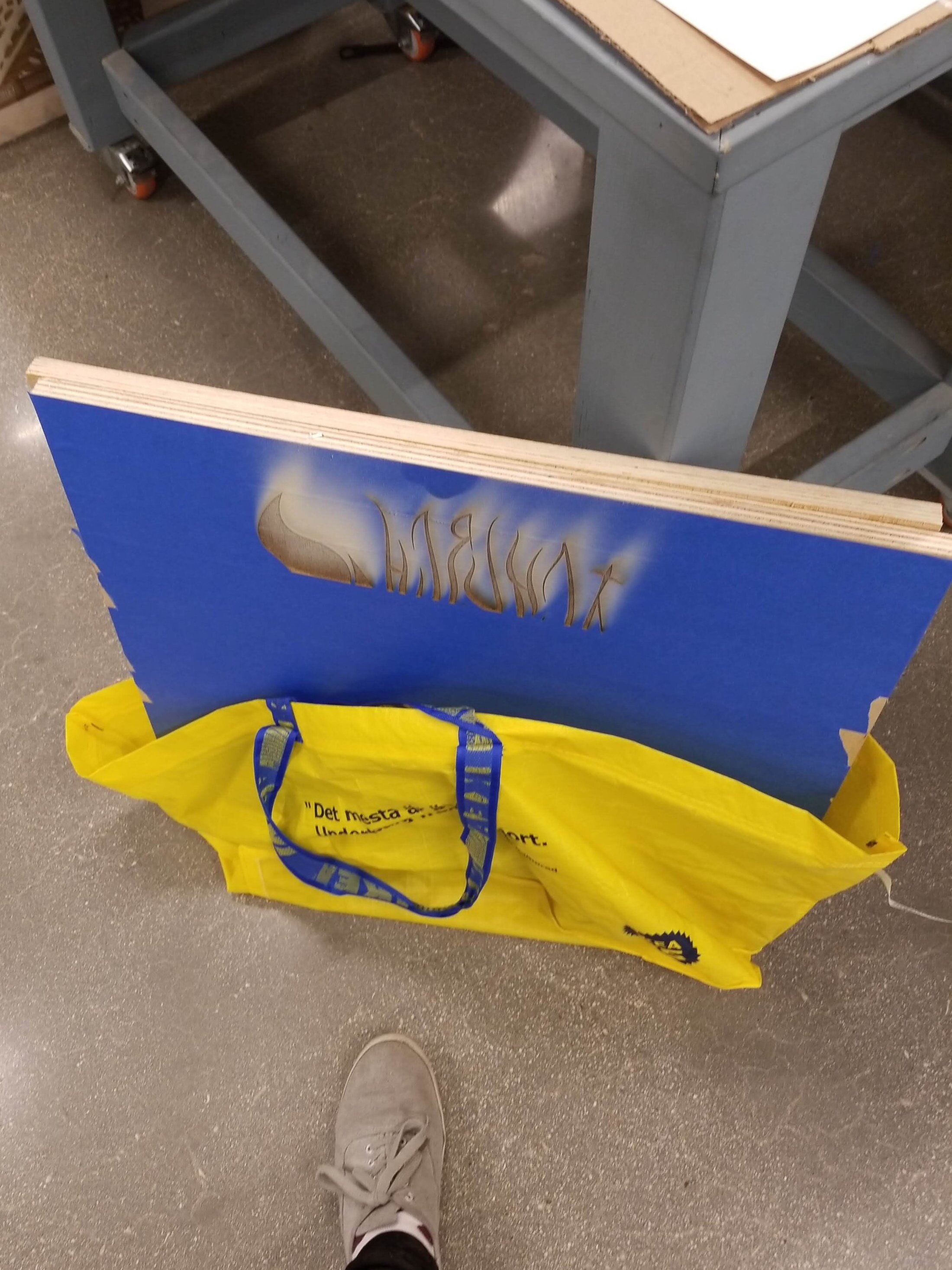
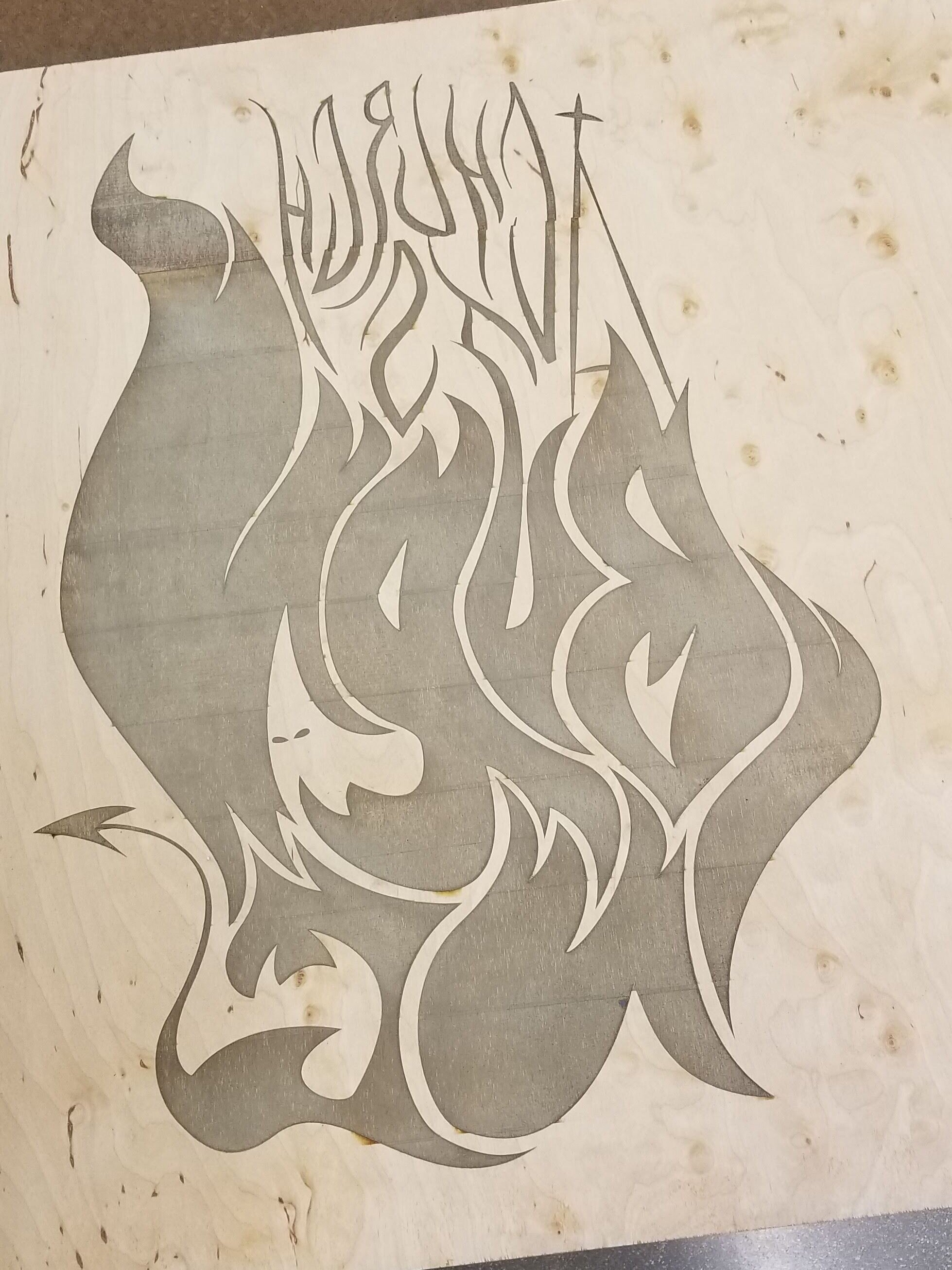
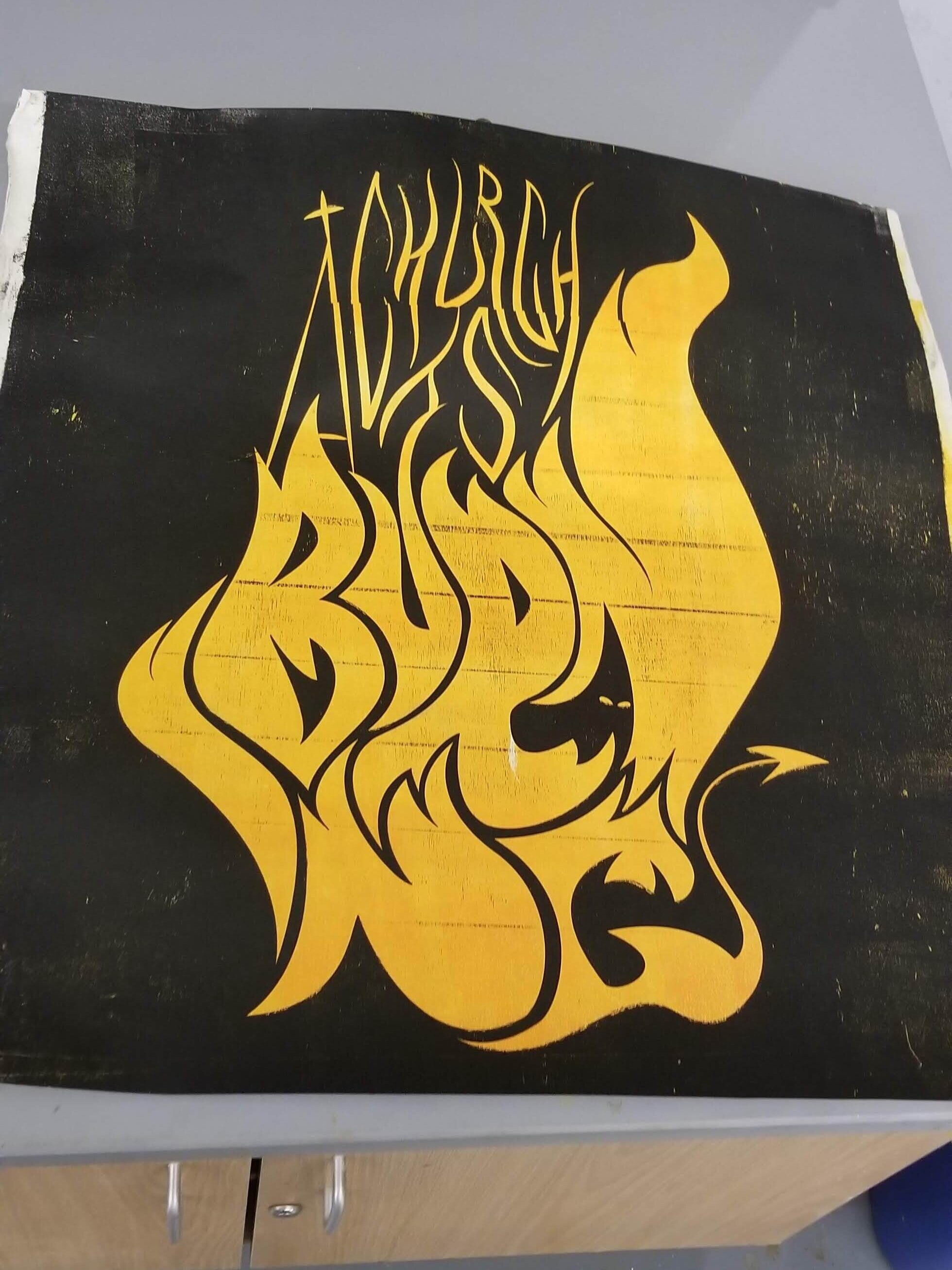
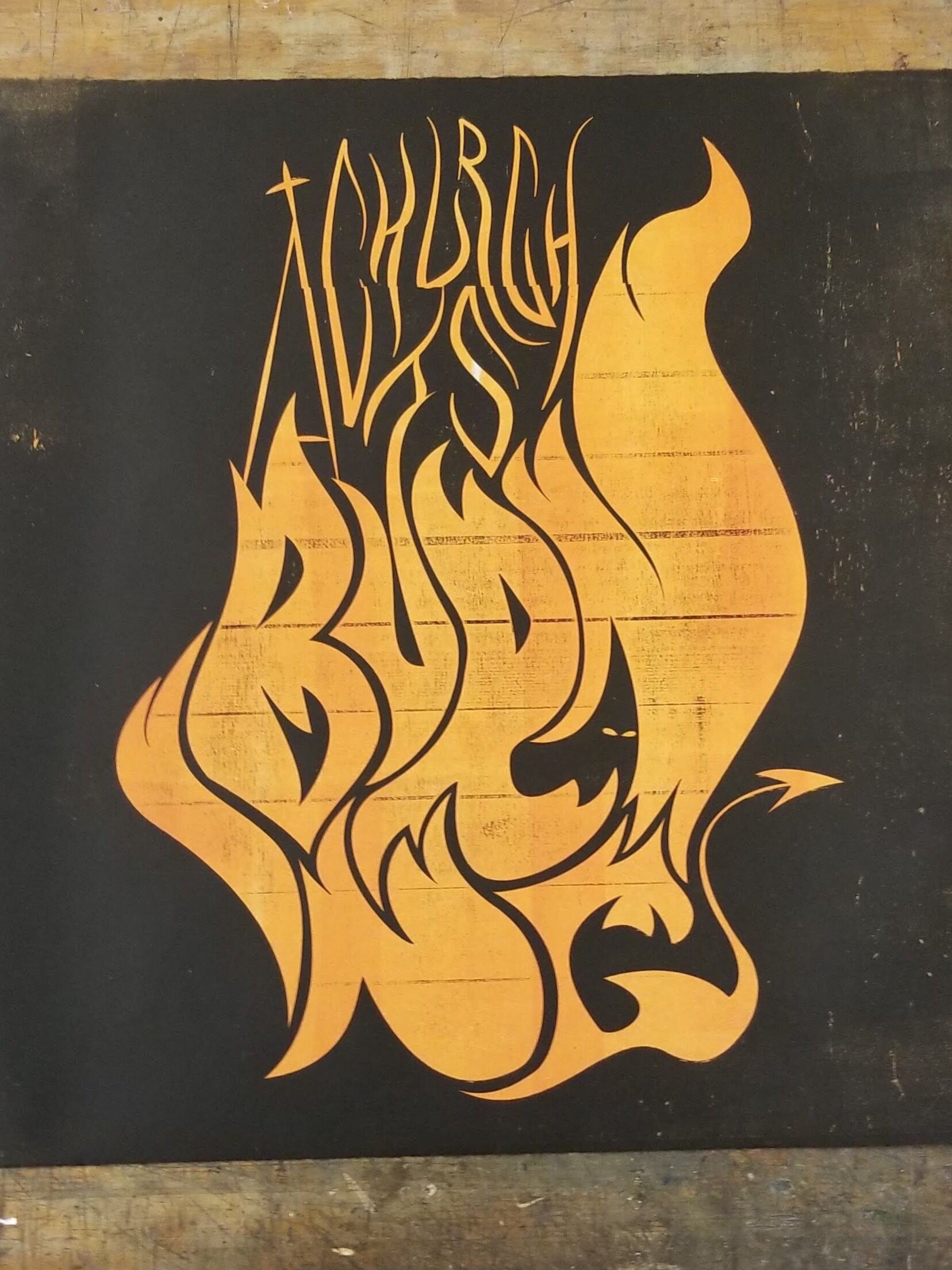
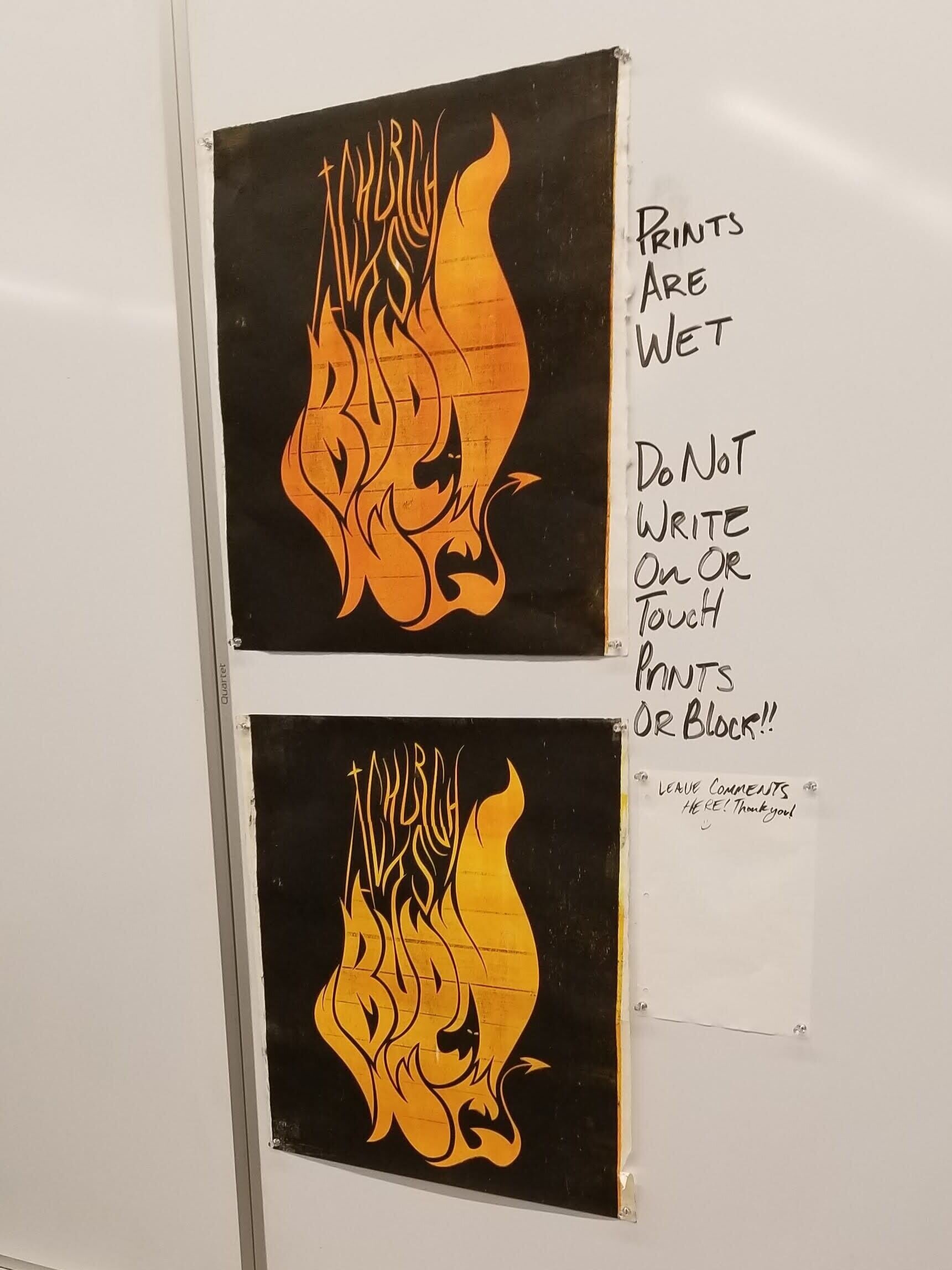
While in this course, I happened to have been taking a relief printmaking class at the same time. I was inspired by a previous project to take the extra step and carve a wood block to print instead of just using a digital texture to achieve the effect I was looking for. To do this, I utilized the university’s router machine to burn the file into a piece of plywood before taking it to the printmaking studio and hand printing the image in reverse. This left me with a textured and vibrant print in three variations of color so that they could be compiled into a varied design.

Coming Together
After printing the image, I photographed and edited the design, as it was too wet to scan. I used Photoshop to correct some of the major printing flaws that occurred from the router encountering technical errors. I decided to leave the majority of the texture on the black sides of the design because they started to create ember-like forms that added to the image.
Following editing, I added type along the top and bottom as information for the hypothetical concert to satisfy the project requirements. I chose a bolder type face with a light texture and gradient effect to match the design.
Voertman’s 60th Annual Competition
2020 Featured Work
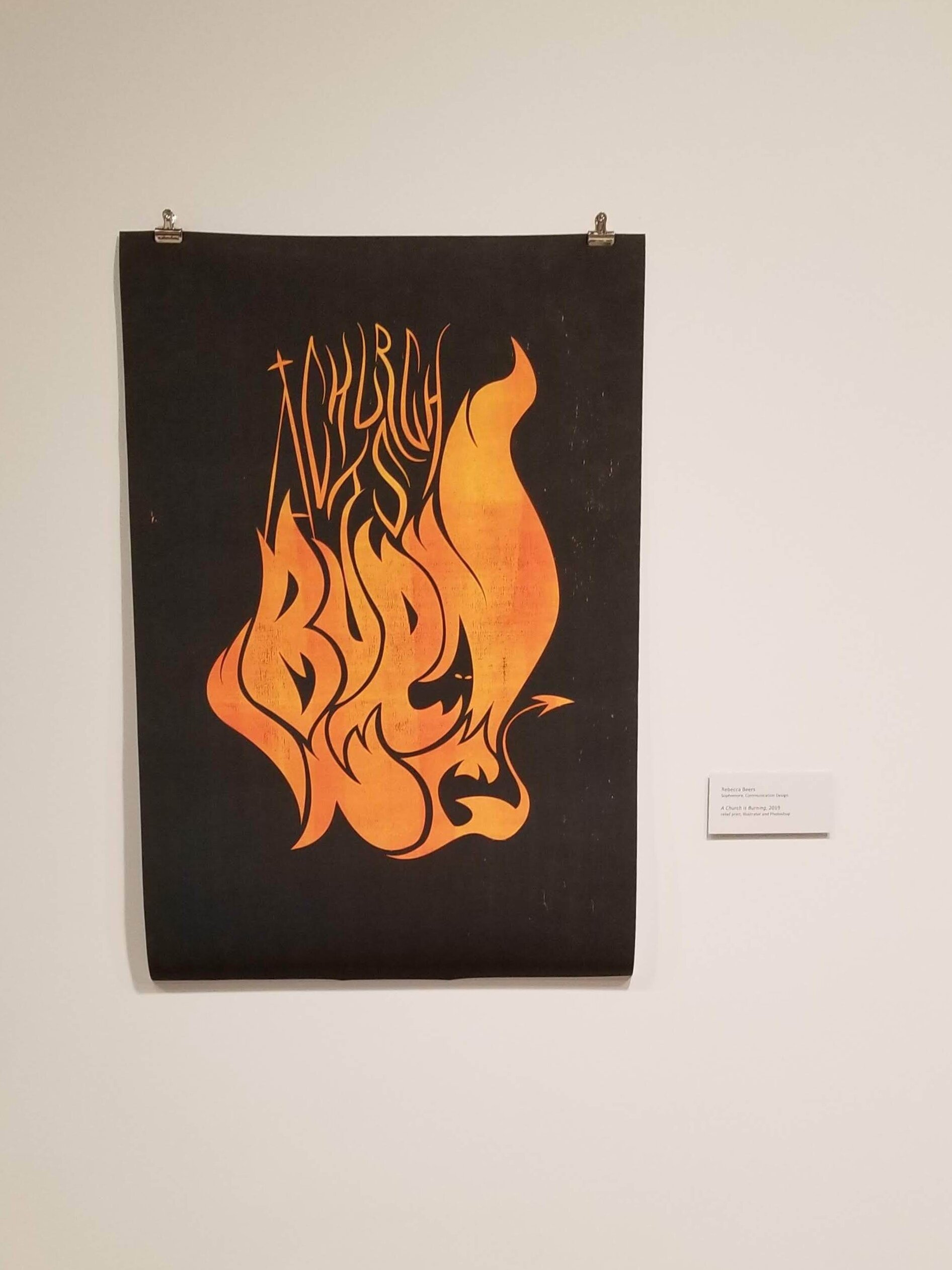
Following the completion of the project, I submitted the poster to a competition curated by Andrea Karnes, senior curator of the Modern Art Museum of Fort Worth, as just the design without the text to highlight the print itself. My poster was admitted to the show as a featured work and was on showcase in the Cora Stafford Gallery for a month as part of the Voertman’s 60th Annual Competition.