

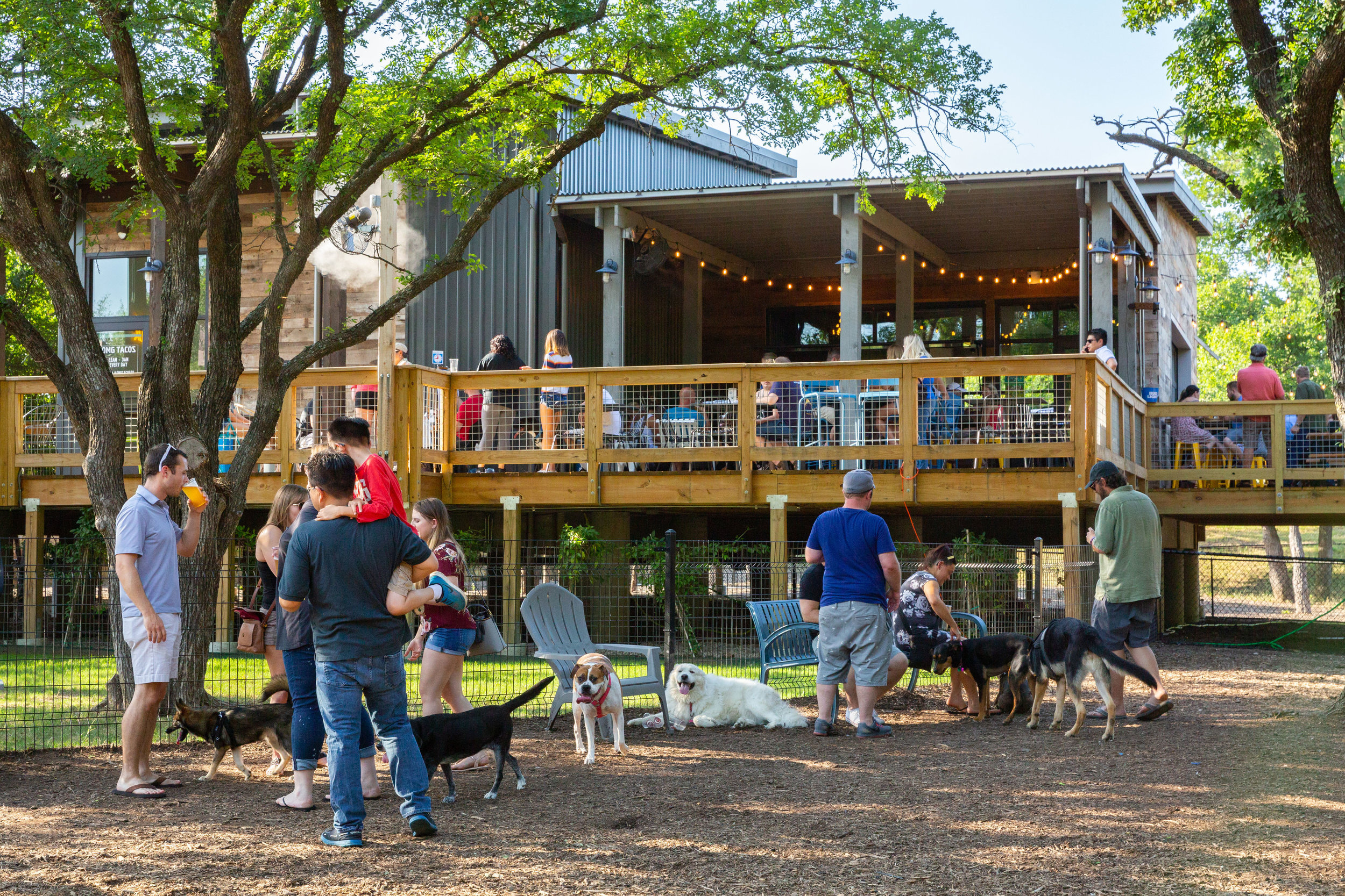
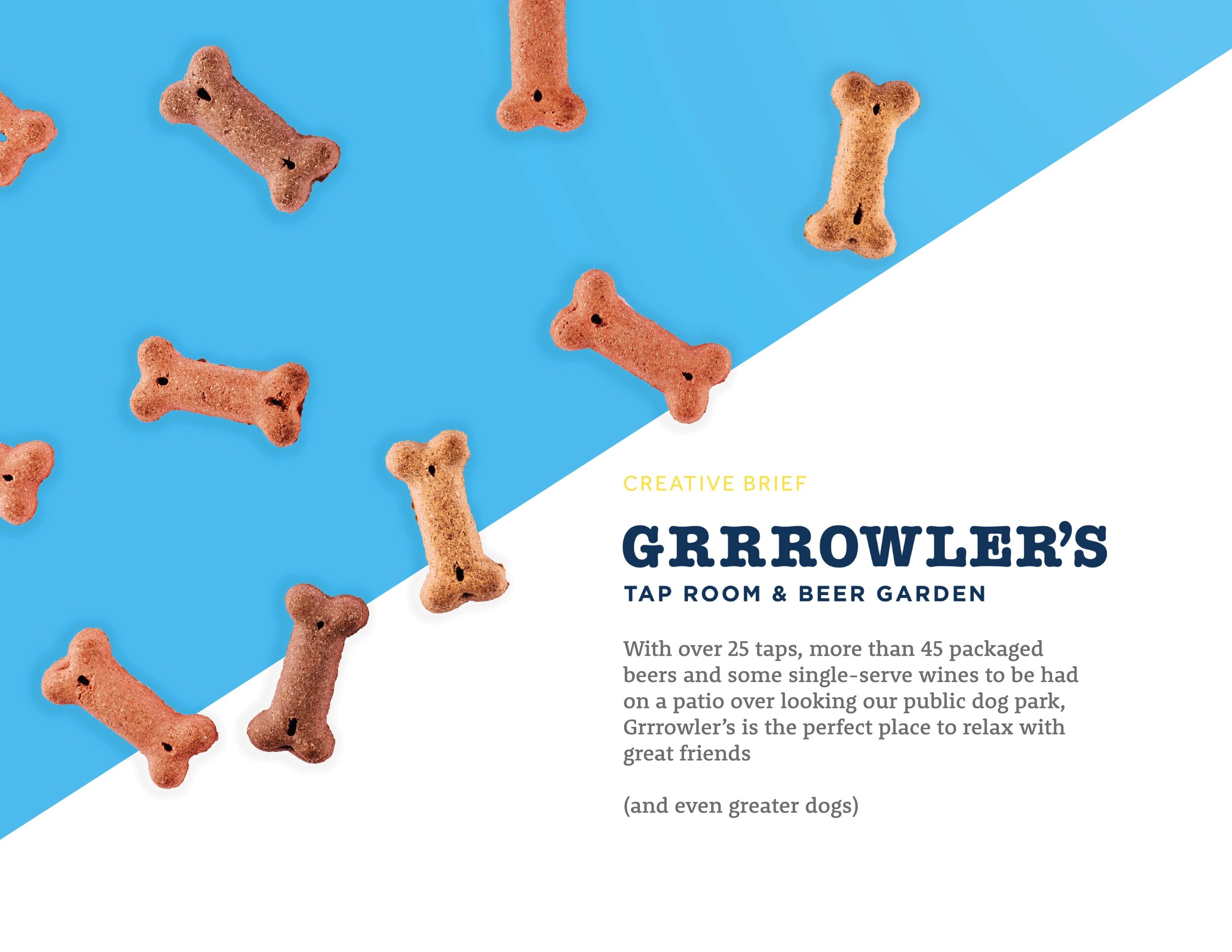
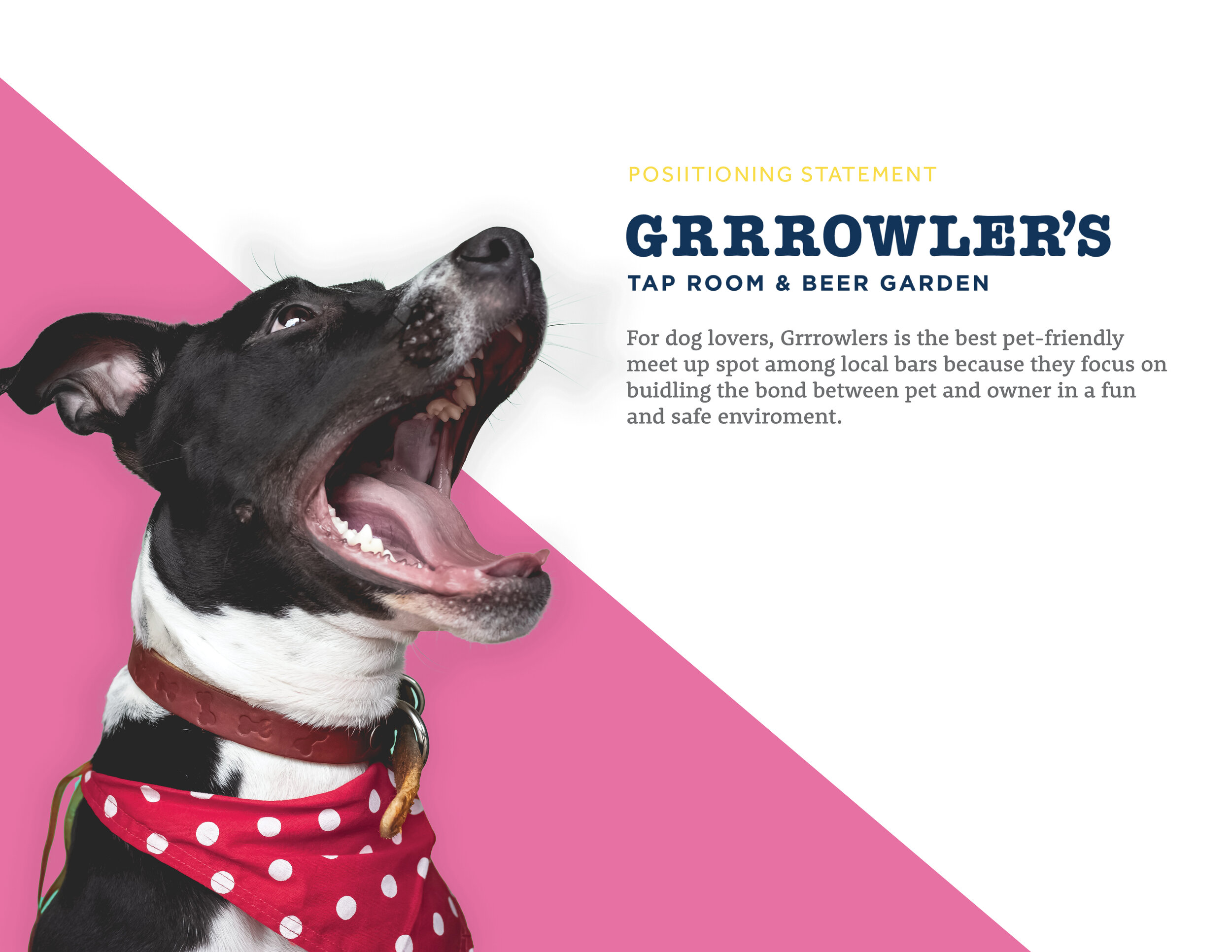
Grrrowler’s
Dog-Friendly Dining
ADES 3545.501 Art Direction - Douglas May - Spring 2021
With over 25 taps, more than 45 packaged beers and some single-serve wines to be had on a patio over looking a public dog park, Grrrowler’s is the perfect place to relax with great friends and even greater dogs!

The project we were given for this class was to create a poster campaign for a unique business by avoiding imagery and using only typography. After working on some thumbnails and debating topics, I decided to focus on trying to tell a story with the ads by mimicking awkward “first meetings” in romance novels. This was intended to showcase the interaction between people and pets, as that is arguably one of the most important selling points of the bar itself.


Refined Concepts
This phase of thumbnails focused on narrowing the type of language used in the ads. There was a lot of room to play around with giving a personality to the dogs in the ads and trying to twist a story from them. Following critique, I decided to follow the path of making the story longer in a block of text so that the reveal of one of the featured characters being a dog came as more of a surprise after reading.
The Final Ads
Translating the ads from thumbnails to posters involved more tweaking than planned as the design was taken to the computer. The concept required working with large block of text, but something I found in the original designs was that it became hard to keep the attention of the viewer through the whole block of body copy.
The solution I came up with was to change the context in which these block of text would appear. Instead of being laid out plainly, the text was changed to appear as a journal entry. This served to add more personality to the narrator of the ads, and also gave me more opportunities to add extra design elements to keep the reader hooked.
The design elements I added included underlining, circling, and highlighting of the type to give emphasis to certain sections. It was a challenge deciding what to give attention to, as I didn’t want the viewers’ eye to jump to the end and spoil the twist, but I settled on trying to distribute the markings somewhat equally in position and quantity across each of the posters to make sure they felt cohesive across the series.
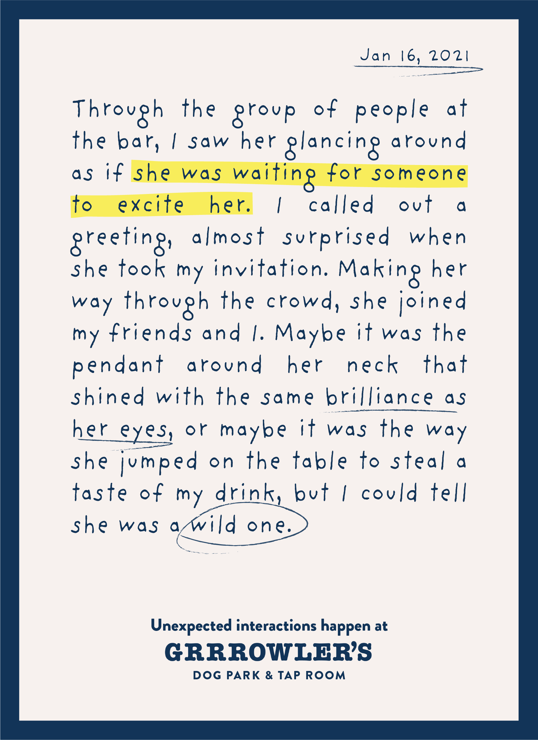
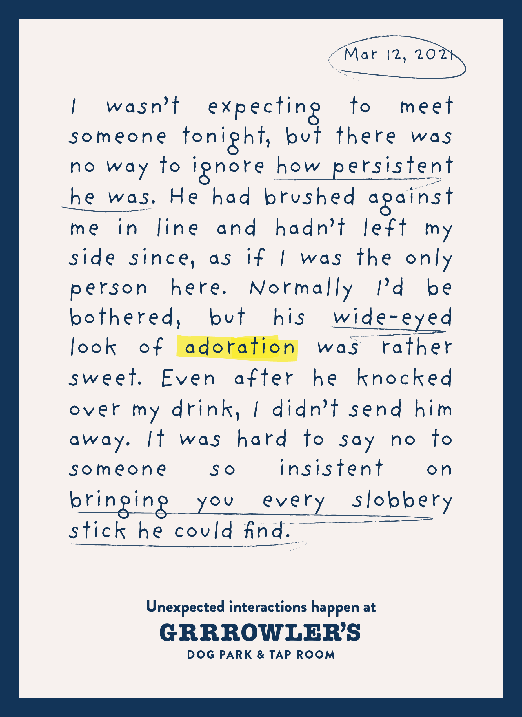
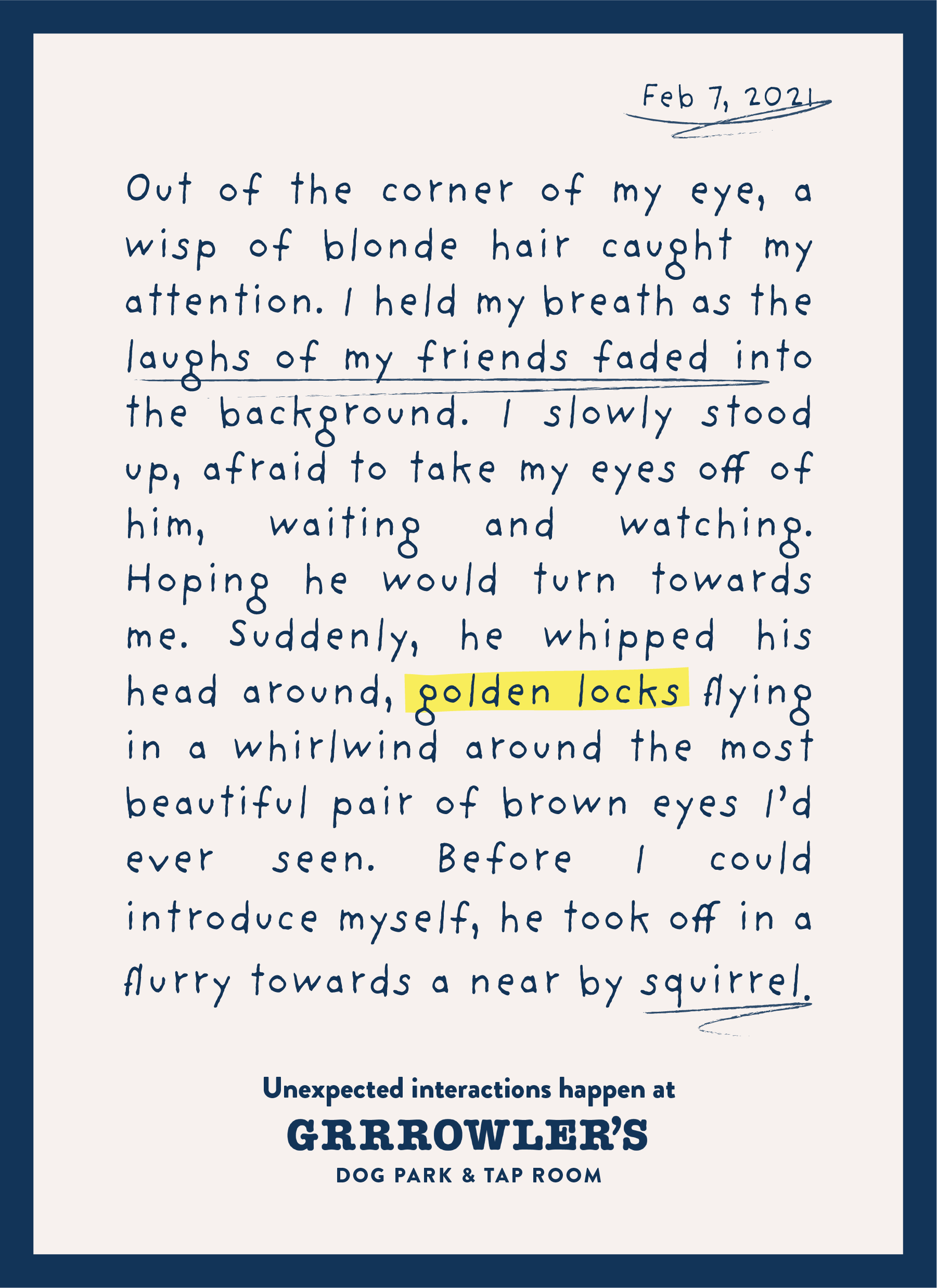

These ads would have been displayed in the surrounding shopping centers and apartment complexes, as the targeted audience was largely young adults in the area who needed a place to socialize and exercise their pets.